How This Website Was Made
In honor of the 20th Anniversary of my registering the domain name marchtwenty.com, I would like to share my insights into the construction of this iteration of this website.
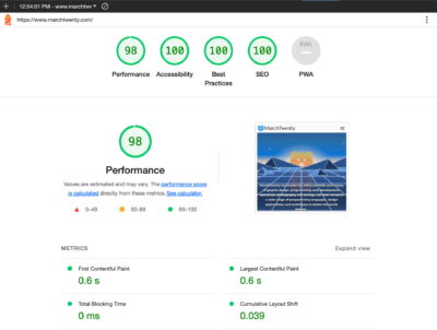
So… what went into making this website? As I’ve learned over the years I tend to take the more difficult route when it comes to my websites. I preferred taking an approach that affords me more personal control over the design and construction of the sites that I build. It lets me challenge myself to find solutions to complex problems without relying on too many third-party plugins or tools. This allows me to produce a final product that is heavily optimized and more directly suited to my needs.
With that said, I’ve had my website for over twenty years, and in that time I’ve redesigned and rebuilt it well over a dozen times for a wide range of reasons. Typically when I would redesign my sites it was usually because of the changes in web design sensibilities or just me discovering new and better ways of building the site with the advancements in PHP, JavaScript, HTML 5 and CSS 3, changes in design esthetics, and so on. With that in mind, much of my base content and posts are carried over from previous iterations of my site going back two decades. For this rendition of my website, I came up with a fun sudo-80s retro theme and rewrote much of the page content.
My WordPress Template
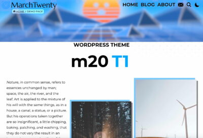
I’ve been using WordPress for over fourteen years now, and the template I have been using up to this point has been a modified version of the default template from 2009. The thing was that I had never properly implemented any of WordPress’ built-in features, so much of the metadata and navigation had been hard-coded into the HTML to fit the needs of my personal site. However this time things are going to be different.
I returned to the drawing board and rebuilt that old WordPress template to properly utilize as much of WordPress’s built-in functionality as possible. All the while keeping the theme flexible enough that it could be easily used for an entirely different website. One of my goals for the theme was to make it generally less dependent on front-facing third-party plugins with speed optimization and SEO in the forefront. That along with modern coding sensibilities in mind as well. On top of that, I have this very WordPress theme up on GitHub as well.
The Features
I worked tirelessly to incorporate as many features into the m20T1 theme as possible, with more on the way.
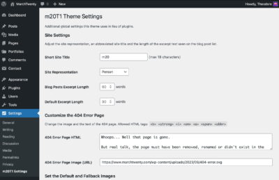
- An additional custom post type that can be easily changed, the default being Portfolio
- An expansion of the User data with things such as popular social media links, location, custom title and the last login time, along with an attractive page for each user
- Widgets incorporated into the header, footer, archives, single post and more parts of the site
- A simple reading time in minutes that generated for each blog post
- A custom JavaScript function that allows for switching to a dark mode with accompanying CSS
- A custom JavaScript function that provides a passively automated Lightbox for images nested in a
figuretag with a link to an image file - A custom admin settings page to allow for the inclusion of additional metadata in the header, as well as content settings to the 404, search error page and post excerpt length
- Usage of the
theme.jsonandeditor-style.cssto give Gutenberg more features and a consistent feel with the site - Expanded the base metadata to accommodate SEO-friendly content that is generated autonomously from the page content
- Activated additional data fields to posts and pages for things such as excerpts, featured images and categories
- Inclusion of a basic page view counter that appears as a column in the WordPress editor
- Utilization and expansion to the media attachment pages with file size, file type and image dimensions displayed
- Incorporated SVG support into the media library and Gutenberg page builder
- Attention was paid to accessibility with the use of
roleandariaattributes, and a few other quality-of-life considerations - Schema.org microdata and JSON-linked data are automatically generated for each page and embedded into the HTML
- Implemented a listing of the child pages into the widgets section of each page
- Inclusion of my own personal CSS normalization styling that I call Tedilize.css
- Fallbacks include: utilizing the first image in the blog post or page as the featured image and the first 90 words of text in lieu of a user-produced excerpt
This theme also comprehensively utilizes WordPress utility pages such as archive.php, attachment.php, search.php and comments.php. All of these features can be experienced just by browsing this site.
The Look and Feel
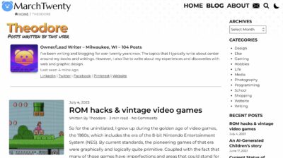
For this theme, I wanted to keep the look pretty modern and minimalistic, with a retro 80s vibe to the overall presentation, without the site looking like it was made in 1985. I scoured the web looking for design cues that I could utilize. Still, I ended up pulling some visual cues from thirty-year-old Nintendo Power magazines which were ripe with funky, retro typography and artwork.
As for the animated front page of this site, I utilized a singular SVG document in the hero image slot as a background element. In that SVG file, I simply used a trick by integrating CSS styling into the bottom of the markup. The CSS allowed me to easily incorporate animation and filter manipulation into the different defined layers and components of the SVG image.
Plugins That I Utilize
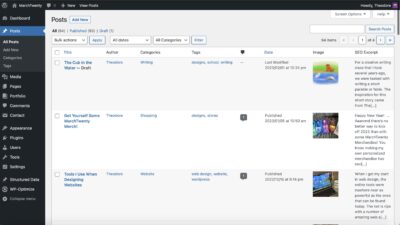
I explicitly tried to use as few plugins on my site as possible. However, there were a few that I chose to use as the alternative would be a lot of unnecessary work on my part even though I did try to use WordPress to its maximum potential. Built into m20T1 is the basic functionality of several popular plugins as a challenge to myself and to cut down on some of the overhead. I did however use a few backend plugins such as Redirection, Contact Form 7, WP-Optimize and WPCode Lite.
Tools That I Used
I’ve gone to great lengths to optimize everything as much as I can and to keep the overall size as compact as possible. In doing so I’ve used a litany of local and online tools to assist in that. In a previous blog post, I listed all the apps and online tools I typically use when building websites including this one. However, I did neglect to mention some of the browser plugins that I use, such as Grammarly, which has been quite helpful in fixing my many spelling and grammar errors, and of course, there’s Google Lighthouse to make the Googling happier.
The Future
As of this writing, I’ve been actively updating the m20T1 on GitHub since I first hosted it there. Features that I’m working on include switching the theme to CSS Grid, the removal of my personalized assets and a few other adjustments to the functionality on the front-end of the site.
Ultimately, the process of building my own WordPress theme and customizing it taught me a lot about the inner workings of WordPress. What I gained from this experience I have been actively applying to my other work.
🚫 The comments are closed for this article.